The stripe on a Vans sneaker can identify it from across a room. Blends found a way to change that detail without losing its familiarity: turn it into a bone. The result became a signature of the boutique’s relationship with the California footwear brand, but the story behind that choice began before the collaboration.
Blends connects Japanese and Southern Californian references. Its history gives the name a practical meaning: bringing visual worlds together without filling every available surface with information.
Beginning in Costa Mesa
The LAB identifies Costa Mesa as the first shop and Tak Kato and Mike Toe as founders raised in Japan. The tenth anniversary in 2013 places the beginning in 2003.
Those influences do not reduce neatly to a formula with Japanese taste on one side and American culture on the other. They describe people deciding which things belong in a conversation. A familiar shoe can look different beside particular garments, or in a room that directs attention to its shape.
Blends is especially interesting because presentation became part of that selection. The room did not have to compete visually with everything it contained. The company’s own explanation of one Los Angeles project makes the principle unusually clear.
Giving the product room to breathe
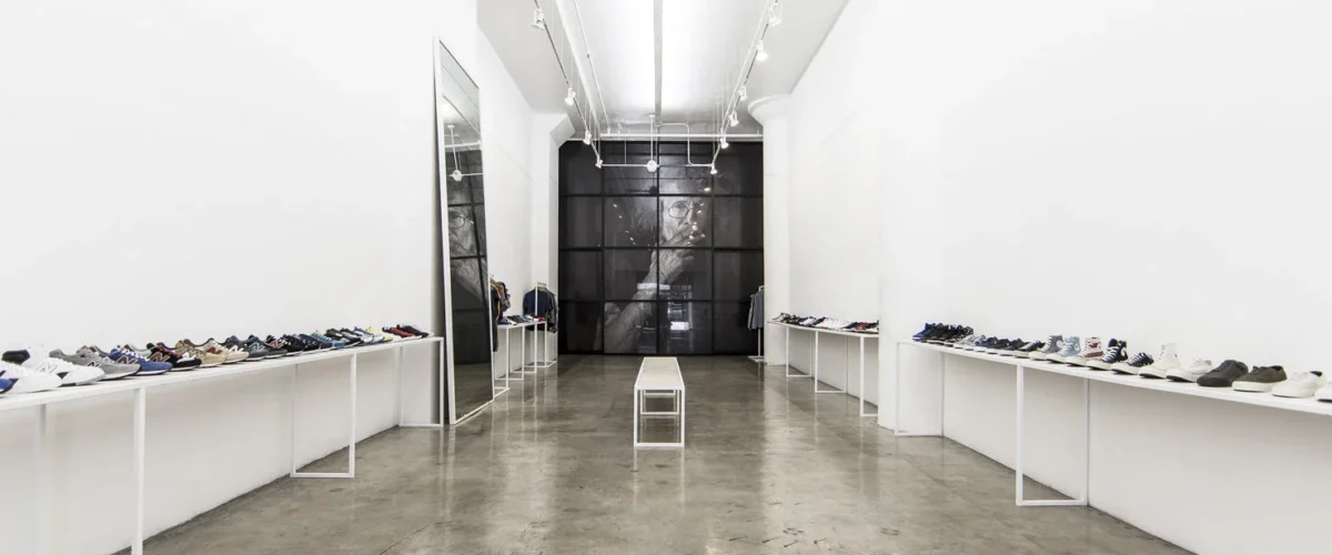
In a 2015 journal entry, Blends described the Los Angeles location it had opened in 2013, following its earlier Old Bank District shop. Simple fixtures and open space created what the retailer compared to a museum-like setting for clothing and footwear.
The stated intention was to let visitors explore rather than surround them with constant product pressure. This is an account of a documented historical interior, not a claim about a recent visit. It nevertheless explains a useful design principle: editing a retail environment can involve taking things away.
In sneaker retail, where dense displays and frequent launches can compete for attention, space around a shoe changes the pace of looking. Proportions, materials and construction become easier to notice before the price tag. The architecture quietly asks which details deserve a closer look.
An anniversary creates a visual signature
For its tenth anniversary, Blends worked with Vans Vault on the 2013 Sk8-Hi Reissue Zip LX. The retailer’s archive highlights a heel zipper and the bone-shaped side stripe. The intervention preserved the familiar silhouette while changing the character of its most recognizable graphic feature.
Launch material attributed Tak’s inspiration to an old pair of motorcycle gloves. Leather, stitching and the closure connected the shoe with another kind of clothing. It is a useful example of a collaboration beginning with an apparently distant object and finding a relationship with an established footwear design.
The release also shared a San Diego event with a presentation of Taka Hayashi’s collection. Footwear, art and an in-person gathering occupied the same setting. The product and the cultural activity around it were being presented together, rather than treated as competing purposes for the shop.
A small change with a lasting identity
Blends returned to the bone motif in later versions. Counting every color is less revealing than noticing how much recognition a simple graphic can carry. Vans remained identifiable, while the boutique contributed a visual decision that made the collaboration distinguishable from a standard edition.
The same idea connects the shoe to the store interiors. A few deliberate choices can change how something familiar is seen. In Blends’ history, the open space around a display and the altered stripe on a Vans belong to the same discussion about attention, selection and identity.
Sources and further reading
Blends: 2013 Sk8-Hi Reissue Zip
Blends: the Los Angeles store concept
The LAB: Tak Kato, Mike Toe and Blends
SneakerFiles: Vans and Taka Hayashi launch at Blends
Related store histories
Vans
Undefeated