Peter Moore holds a distinctive place in sneaker history because his work connects products with the way they are presented, recognized and remembered. The Air Jordan 1, Nike Dunk and adidas Equipment offer different ways to examine that connection. Shape, color, symbols and communication belong to the same larger design problem.
Reducing his career to a list of shoes misses that breadth. A logo must remain legible at different sizes. Footwear has to communicate while someone is moving. A campaign must connect an object to a person or community. Moore worked across those concerns, and his contribution becomes clearer when the resulting choices are studied together.
Why the graphic-design background matters
The Peter Moore Created archive, maintained by family and collaborators, describes work his studio produced for Nike, including posters and catalogs. It also recounts his partnership with Rob Strasser in organizing the company’s creative work. The relationship between design and brand identity was already central before the Air Jordan 1 became his best-known product.
Graphic design organizes attention. On a page, size, contrast and placement determine what a viewer notices first. On a shoe, panels, color and branding can do similar work. The surface changes, but the question remains useful: what should register immediately, and what can be discovered after a closer look?
That connection does not make graphic design and footwear design identical disciplines. A shoe adds requirements involving fit, structure and manufacturing. A broad creative perspective can help those areas communicate a consistent idea; it does not replace the technical expertise required to produce a functional object. Moore’s career is more interesting when these forms of work are connected without being collapsed into one.
Air Jordan 1: a signature readable at a distance
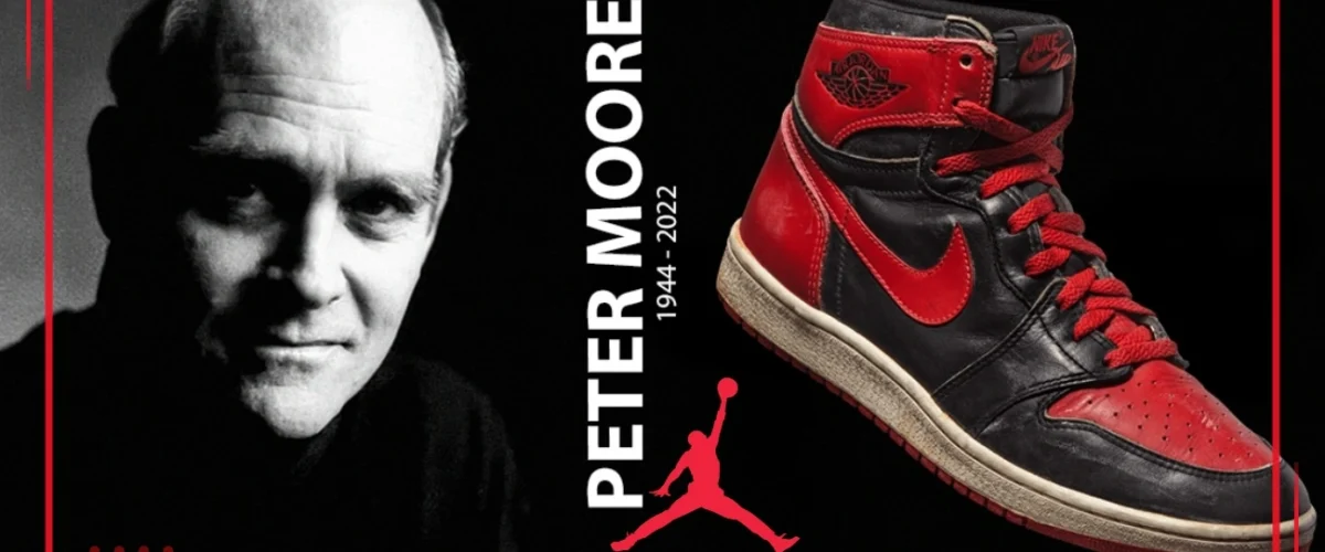
Nike’s official archive identifies Moore as the Air Jordan 1’s designer and records its original release in 1985. That credit matters because Tinker Hatfield’s later association with the Jordan line sometimes causes confusion about who designed the first model. Attribution should follow the specific project, rather than the best-known name associated with an entire franchise.
The Air Jordan 1 upper presents recognizable regions: toe, forefoot overlays, side panel, collar and ankle area. Color placement can emphasize or soften their boundaries. Someone familiar with the silhouette can read its construction without inspecting a label. The lateral Swoosh and Wings emblem add different layers of identification to that underlying shape.
This visual organization helps explain why relatively small color changes can produce such distinct identities. Turning one panel from white to black or red changes its relationship to the neighboring areas. It does more than alter the shoe’s overall shade. The pattern provides a system capable of accepting new interpretations while retaining a recognizable structure.
Its sporting, commercial and cultural history extends beyond that initial design. Our Air Jordan 1 history follows the broader context without assigning every development to one person. Moore’s design belongs to a collective project involving the athlete, development staff, marketing and distribution as well as the footwear itself.
Wings: a symbol developed alongside the product
The Moore family archive includes the winged basketball emblem among his creations. On the shoe, it occupies its own space above the large side Swoosh. The two marks coexist while giving the athlete’s identity a distinct area within the manufacturer’s identity. Their relationship is an important part of the composition.
Visually, the ball makes the basketball connection immediate, while the wings suggest flight. Image and name form a compact emblem. Silhouette, contrast and legibility are central to how it works, all familiar concerns in graphic design. Placement matters too: the ankle area can make a relatively small mark more noticeable than its dimensions alone would suggest.
Wings and Jumpman are not interchangeable names. They identify different images with different histories of use. A careful account need not merge photography, logo development and later product applications into one miraculous moment. Separating those stages preserves the contribution of each participant and avoids compressing a long career into a convenient anecdote.
Nike Dunk: color and collective identity
The Dunk illustrates another approach to identification. Instead of organizing the whole message around one athlete, the college program emphasized teams. Nike’s account of College Colors places Moore within a group including Strasser and other contributors who coordinated footwear, apparel and accessories.
Viewed as a product, the color blocking allows a shoe to act as an extension of a team’s visual identity. The structure must accept multiple combinations while remaining recognizable as the same model. Clear panel boundaries help make that possible: one color can define the overlays while another occupies the base, maintaining a readable arrangement even when the shoe is in motion.
The Dunk and Air Jordan 1 belong to a shared 1980s basketball context, but they should not be treated as the same product with different labels. Similarities between their shapes invite comparison. Campaign roles, audiences and later histories still require separate treatment. Our Nike Dunk history follows that development into other communities and skateboarding.
Air Jordan 2 and the importance of shared credit
The Air Jordan 2 archive records its 1986 debut and credits both Peter Moore and Bruce Kilgore. This is a useful reminder that a designer’s biography should not absorb every team project as an exclusively individual work. Acknowledging collaboration makes the history more precise rather than weakening the designer’s contribution.
The absence of the side Swoosh also creates an instructive comparison with the first Jordan. Remove the most obvious mark from that position and recognition has to depend on other elements. Shape, finish and Jordan-specific identity carry more of the burden. The design demonstrates that building a stronger identity does not always mean placing a larger logo on every available surface.
adidas Equipment: designing a complete system
After their Nike work, Moore and Strasser’s partnership took on a different context at adidas. The archive’s Equipment account describes a return to sporting needs and an effort to organize products and communication around that direction. Adidas marked the line’s thirtieth anniversary in 2021, placing its beginning in 1991.
According to the archive account, the approach to adidas leader René C. Jäggi grew from the company’s difficulties in 1989. Equipment’s launch centered on the 1991 Boston Marathon: volunteers wore green jackets, and winner Ibrahim Hussein ran in Equipment. The example connects product, event presence and color in a single action. It makes the system visible beyond a catalog page. The visual system paired green, white and black with an ascending three-bar mark, reorganizing the stripes and adidas name to identify Equipment.
This contribution should not be confused with inventing every adidas graphic asset. The Trefoil and the earlier history of the three stripes did not begin with Moore. His work concerns a specific reorganization of the brand’s visual vocabulary and a creative program involving other people. Accurate boundaries around the credit clarify what changed and why it mattered.
Restriction can make a design more recognizable
A limited palette makes proportions, materials and the distribution of surfaces work harder. Rather than selecting any possible color for each release, designers have to find variety within shared rules. When reading Equipment products visually, that discipline helps explain how different models can feel like members of the same family without repeating an identical pattern.
It also changes how a collection is encountered. A single product may communicate through its silhouette, while several products together reveal the consistency of the larger system. This is a useful way to understand the connection between graphic direction and industrial objects: each item has its own requirements, but the audience can still recognize a coherent voice across them.
How to recognize Moore’s contribution today
Try comparing an Air Jordan 1, a college-color Dunk and an Equipment product. Trace where your eye goes, how the symbol relates to the surrounding surface and how colors separate the components. Their relationship lies less in one repeated silhouette than in the attention given to recognition and visual organization.
It is also worth separating original design, creative direction and later interpretation. A contemporary collaboration may use a structure developed decades earlier while introducing choices made by a different team. Carrying a historic silhouette does not automatically credit every detail of a new edition to its original designer. The object has more than one moment of authorship.
Within the broader history and culture of sneakers, Peter Moore shows how footwear design can reach beyond the outline of a shoe. His significance emerges in the connection between object, image and recognition. Studying that connection makes it easier to appreciate both the specific design and the collaborative work that allows an idea to remain influential.
Sources and further reading
- Peter Moore Created: The Start of Nike Design
- Peter Moore Created: About
- Peter Moore Created: Peter’s Process
- Nike: Air Jordan 1 archive
- Nike: Air Jordan 2 archive
- Nike Archives: Full-Court Press
- Peter Moore Created: adidas Equipment, A Look Back
- adidas: Celebrating 30 Years of Equipment, 2021
Frequently asked questions
Did Peter Moore or Tinker Hatfield design the Air Jordan 1?
Nike’s official archive identifies Moore as the Air Jordan 1’s designer and records its original release in 1985. That credit matters because Tinker Hatfield’s later association with the Jordan line sometimes causes confusion about who designed the first model. Attribution should follow the specific project, rather than the best-known name associated with an entire franchise.
Did Peter Moore create the Wings logo?
The Moore family archive includes the winged basketball emblem among his creations. On the shoe, it occupies its own space above the large side Swoosh. The two marks coexist while giving the athlete’s identity a distinct area within the manufacturer’s identity. Their relationship is an important part of the composition.
What was Peter Moore’s role in the Nike Dunk?
The Dunk illustrates another approach to identification. Instead of organizing the whole message around one athlete, the college program emphasized teams. Nike’s account of College Colors places Moore within a group including Strasser and other contributors who coordinated footwear, apparel and accessories.
Did Peter Moore design the Air Jordan 2 alone?
The Air Jordan 2 archive records its 1986 debut and credits both Peter Moore and Bruce Kilgore. This is a useful reminder that a designer’s biography should not absorb every team project as an exclusively individual work. Acknowledging collaboration makes the history more precise rather than weakening the designer’s contribution.
What did Peter Moore contribute to adidas Equipment?
Peter Moore worked with Rob Strasser on adidas Equipment, launched in 1991 around a return to sporting needs. Its visual system combined green, white and black with an ascending three-bar mark. This was a specific reorganization of adidas’s identity, not the invention of the Trefoil or the original three stripes.